


Adobe color palette is one of the most critical aspects of art and design. Color is the starting point for nearly all creative excursions, whether used to transmit emotional states, activate activities, or establish the tone. Color is an essential aspect of many artists’ creative processes. Picasso’s Blue Period and Rose Period are two of the most well-known color as dominating subject collections. Frigid, melancholy tones and sad subject matter characterize the Blue Period. Portrait after portrait reveals closed-off stances, crossed arms, and slumped shoulders. You may feel Picasso’s melancholy spreading forth. Subjects loosen up when he enters his Rose Period, standing comfortably, open, and linked with tenderness. Of course, the colors are warm, rich corals, pinks, and nudes. Creatives make these first color choices in a variety of methods.


List of Adobe Color Palette programs:
Some people begin with a precise shade, while others embark on a visual color journey, studying trends and artwork in their field or using images as a guide. Regardless of your color journey, Adobe color palette has made it easier to locate and create coherent color palettes. Adobe Color is a community of artists that develop and share color themes and inspiration. Adobe desktop and mobile apps can use color themes from Creative Cloud Libraries or the Adobe Color service. Everything works in tandem to ensure a seamless creative workflow.
Read the following article curated by Feedhour to learn more about
the Adobe color palette and Adobe color palette generator. Also, visit the official website of Adobe to grab some exclusive insight into the Adobe color palette.
1. Explore
The Explore page now includes a selection of content from Adobe Stock, Behance, and the Adobe Color community. Scroll through the curated feed for ideas, or search communities individually by filtering by source. Adobe color palette makes it simple to navigate to Adobe Stock for licensing photos or Behance to follow artists, learn more about their work, or view the complete project. Click on the project title to learn more or on the artist’s name to visit their Adobe Stock or Behance page. With contextual searching, Adobe Color has enhanced the search experience by allowing you to identify the type of color you are looking for accurately. Adobe Sensei harnesses the power of artificial intelligence and machine learning to recommend relevant tags based not just on color but also on contextual searches such as “moody,” “happy,” and “calm.” Adding themes to your library takes just one click, and they sync with your desktop and mobile apps via the Creative Cloud — or you can download the music as an ASE swatch file to use in Adobe programmes. UX designers will appreciate the option to copy in several web development formats, such as CSS and XML, and the ability to click a swatch and copy the Hex value to the clipboard.
Also Read: Adobe Capture: Your One-Stop Shop for Everyday Graphics
2. Trends

They selected artwork galleries in many design areas, such as graphic design, illustration, and fashion, for people who want to know what their colleagues are doing with color. These galleries, curated by the professionals at Adobe Stock and Behance, provide an insight into the newest palettes that your fellow creatives are working with. Colors from architecture, game design, and nature will delight your eyes. Discover sensuous color magic via flavour and travel. Use the hashtag #AdobeColorTrends to share your favourite trends or how you use Trend palettes on social media.
3. Pantone
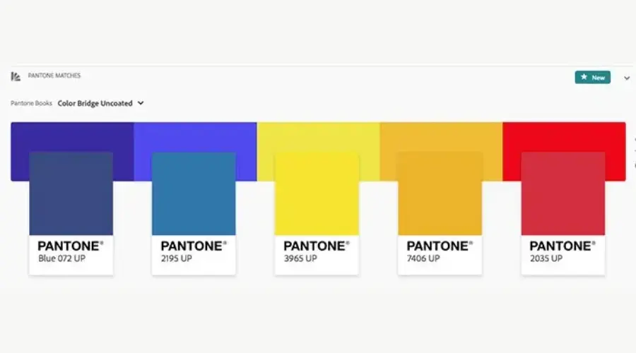
The Pantone colour workflow will appeal to print creatives, surface designers, and spot colorists. Pantone delivers a common colour language that allows marketers and manufacturers to make colour-critical choices at every process level. Pantone products and services are for over 10 million designers and producers worldwide to help define, communicate, and control colour from inspiration to realisation — leveraging advanced X-Rite technology to achieve colour consistency across various materials and finishes for graphics, fashion, and product design. Convert your colour themes into Pantone versions and use them in Adobe programmes to create spot colours quickly.
Choose “Pantone Match” from any theme to change the colours to a Pantone colour theme. Choose your book and match the Pantone colour to create your ideal print palette. Download the Adobe ASE file or Pantone swatch picture to share with your partners. Drop the Adobe ASE file into the icon of any Adobe programme that supports Pantone themes to load your Pantone theme into the swatch panel quickly.
4. Create
We understand how essential the Create workflow is to our users. Therefore all of the familiar tools have been updated. To make your colours pop on a new white desk, enable Dark Mode. To see Color Harmony Rules in action, set your base colour and move the colour drops around the colour wheel. Select “custom” to customise your swatch colours. Do you have an image that gives you tremendous inspirational vibes? To build a colour palette, drag it into the “Extract from Image” procedure. Select from various colour moods depending on the saturation of the colour and the quantity of black in each swatch, or drag the colour bubbles to manually select hues in the image. Then return to the main colour wheel to fine-tune your palette.
5. Community of Color
We’d love to continue the conversation! Help us determine Adobe color palette future by sending feature requests or comments using the feedback icon in the main menu. You may reach out to the team on social media by using the hashtag #AdobeColor, and you can always contact us through the Creative Cloud Twitter, Facebook, and Instagram accounts.
Conclusion
These are the Adobe color palette that you should know about. Color is one of the most critical aspects of art and design moreover, you can also visit the official website of Feedhour to learn about the color palette Adobe and adobe color palettes.
FAQ’s


